This past week, the World Ultimate and Guts Championships (WUGC) were held in London. The USA swept all divisions, Team Canada’s Danielle Fortin executed an impressive greatest, and people around the globe tweeted about the championships. I had been thinking about playing with twitter data for some time – particularly with respect to ultimate and WUGC seemed like the perfect oppurtunity. WUGC is an international event and it lends itself well to showing ultimate’s influence around the world, and with the hashtag #WUGC2016 prominently displayed on the WUGC website and plenty of tweets using it, I was hopeful I could make something cool.
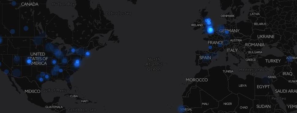
The Map
CartoDB makes this kind of map easy to build. I pulled tweets with #WUGC2016 over a 30 day period, styled the map with CSS, and used torque.js to animate the tweets by timestamp.
I really enjoy watching this animation. It starts with a slow build-up and scattered tweets all over the globe. Then London lights up with a pulse of tweets during each day of competition. My favorite part is watching teams get support from their home countries during play. Check out Colombia, India, South Africa, the Philippines, and UAE – all have pulses of tweets from fans back home.
Allow me to get nerdy for a minute…
While the map is cool to look at, don’t go trying to derive any strong scientific conclusions from it. There are a few things to note here: This map only uses tweets that are geolocated (i.e. Tweets that have location data enabled). Geolocated tweets make up about 5% of all tweets – so this is a small (and not necessarily representative) sample. CartoDB uses what they call “geo-enrichment” to increase those Twitter search results up to 15% to 20%. Much of that additional 10% - 15% seems to come from tweets that have country-specific location data – but no finer geographic detail. In those cases, CartoDB uses a fixed point near the geographic center of that country to plot the tweet location. As a result, there are tweets popping up in places you might not expect. Go back and watch the animation again. A constant stream of tweets from northern Kansas? The Northwest Territories in Canada? The middle of the Sibuyan Sea in the Philippines? Central Australia? Doubtful. With all that in mind, we can draw broad conclusions about when and how often people in specific countries are tweeting, but beyond that – approach with caution.
More maps are coming soon. Until then, enjoy the eye candy.