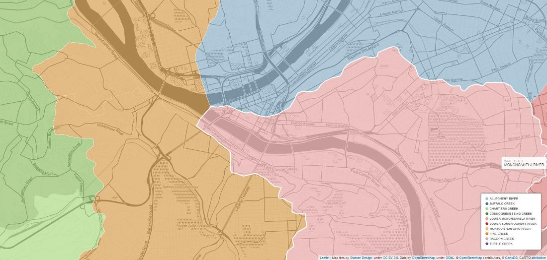
My goals with this map were to successfully apply that hover-over-a-watershed-and-the-polygon-lights-up technique that you can see in the live map and to create a watershed map that was more interactive than I typically see. I also ended up learning about how water flows through the city. Cool.
Watersheds
 Veiw the live version of the map | Check out the code
The goals were visual. Given that, the hue (darkness/lightness) of the small watersheds is basically meaningless. The shading helps differentiate between neighboring polygons, but it is based on the size of the watershed (which is redundant and cartographic bad practice). Instead, I should have had hue based on something that adds information density to the map (e.g. a water quality metric). I didn’t do that because I’m trying to keep my projects small, focused, and complete-able for now. The watershed names and shapes are correct.
